How to Make Effective Landing Pages

A landing page is a web page designed with a specific purpose or goal that it is supposed to fulfil. It is the first page that new visitors land on in order to get information about a product or service. A landing page always has a set target. For example, landing pages may impact sales by generating qualified business leads and directing potential customers to products (or online checkout portals). It can have an indirect impact on sales by encouraging free trials or subscriptions to the original content. It may also encourage registrations in various membership programs. It is important to firstly identify the end goal for your landing page, and build the entire page around that goal. A landing page must have the following components in order to function effectively:

Unique Selling Proposition and Clear Call-to-Action

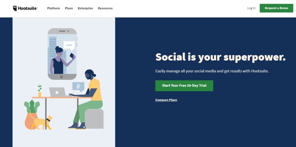
It is important to convey the differentiating feature which makes the particular product or service stand out from its competitors. This is the hook that compels the visitor to take an action. However, the unique selling proposition alone is not enough. It has to be paired with a distinct call-to-action. Having convinced the customer to take an action, it is important to then facilitate that action. This is usually a button (in order to take the customer to the desired destination) or a form (in order to avail information). The copy accompanying the call to action should be compelling, and should highlight the benefits from the visitors’ point of view. It should also be short and to the point. There are multiple approaches to structuring the landing page in terms of Call-to-Action placements. Some pages provide the call to actions at the very top of the webpage. All supporting elements are put under it.

Credibility

Credibility is one of the most important aspects when appealing to new visitors. It is important for the visitors to know that the business is reliable and can deliver what it promises. There are two major ways of gaining credibility – testimonials/reviews and listing key stakeholders. One of the most convincing aspects are testimonials and reviews from past clients and customers. Positive and insightful comments adds a social element to the credibility of the business. Another way of gaining credibility is by listing major partner, client and facilitator businesses. Adding links to well-written case studies on major projects/clients can also help in this regard.

Benefits and Features of the Product or Service

New visitors are not always aware of the features they can expect from a particular service. There may also be features which sets the product apart. Clearly communicating the most prominent and important benefits and features offered by the product/service is therefore very important. Furthermore, providing additional information like pricing (and any free trial offers) may help.

Visuals

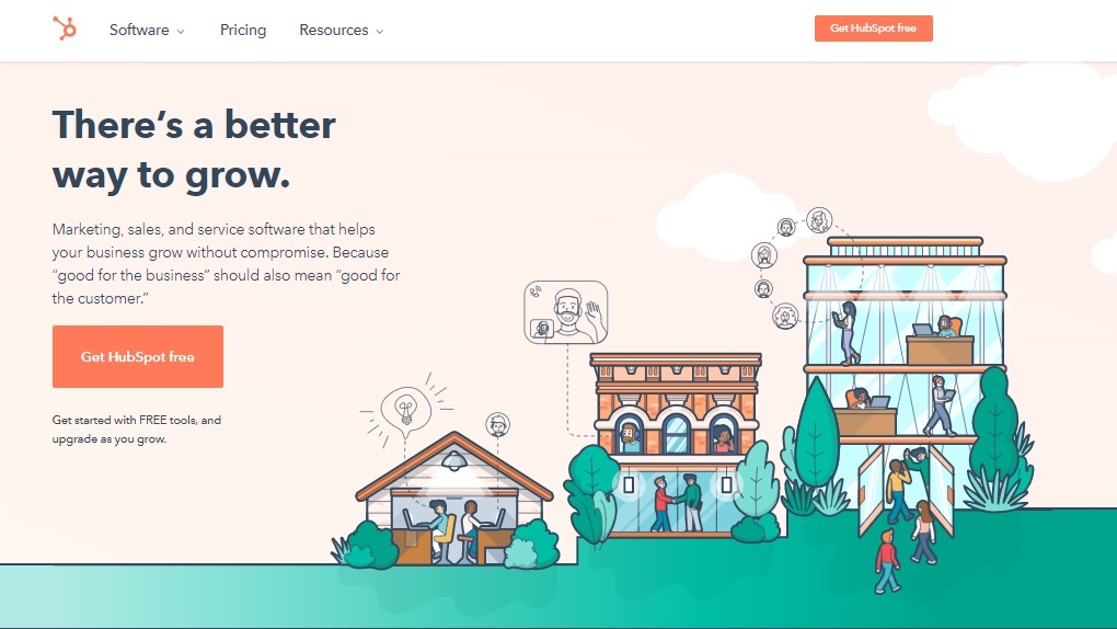
A good balance between texts and visual elements is necessary for any landing page. We naturally respond a lot more to visual cues – and successful landing pages use this nature to their advantage. A wide variety of visuals can be used, including attractive banner images, relevant icons, pictures, and even snaps of the product. A good example of the use of visuals is HubSpot’s landing page. They use a very attractive banner to convey product features, high-level use cases while ensuring proper landing-page aesthetics.

Attractive Headlines, Copies and Text

This applies to all components in a landing page. It is important to have persuasive and succinct copy and text throughout the web page. It is also necessary to use the words which are being used by potential customers to look for such products, services, and features. Good storytelling through texts can go a long way to convert visitors into customers.

Want to bring your landing page to life? SELISE Page Builder can help you bring your vision to reality with the use of pre-built templates and drag-and-drop widgets. Start building your own page for free from the Page Builder landing page , or contact us if you need further information.